
We’re all familiar with the headline figure of the Energy Price Cap.
Set most recently at £1,834 (following Ofgem's reduction in TDCV's), the number serves the useful purpose of providing an estimated average bill for customers.
But rarely is there a discussion about the reality of this figure, and how it can’t possibly reflect the actual bills faced by households across the UK. In short, this is far from the case.
We’ve previously looked at how an annualised Price Cap figure, updated quarterly, isn’t reflective of a customer’s energy bills in a 12m period:
- Winter bills to rise as the Price Cap falls – Here’s why
- What is happening to customers bills each quarter?
- Dropping Prices - Rising Bills. Energy Price Cap Analysis.
How is the headline Price Cap figure calculated?
Overall, there are four issues with the headline Price Cap figure:
- It’s a national average, which rolls up localised consumption levels
- It’s a national average, which rolls up localised prices
- It’s a national average, which uses simple averaging – rather than weighting the inputs
- It only represents the price on direct debit
To calculate the Price Cap energy bill, which is treated in headlines as a single true figure, Ofgem uses the costs of providing energy, and its assessment of a national average for domestic consumption. There are 14 distribution regions in the UK, each with different costs, and the Price Cap is the average energy bill across all regions. However, using the national average consumption is problematic, as actual consumption levels vary significantly across the country, meaning the reported figure doesn’t reflect the typical local bill in each region.
While finding a more effective approach is a much larger discussion, our latest insight could help to inform this thinking. We’ve analysed the extent of the Price Cap's generalisation, demonstrating just how much the typical energy bill varies in different areas, and how far this is separated from the idea of a national Price Cap. We also consider the material consumer impact, comparing local bills with average salaries to determine which areas are spending the greatest proportion of their salary on energy.
For suppliers, this analysis could provide food for thought around the makeup of vulnerability and debt management models, and whether they’re factoring in the realities of regional variation.
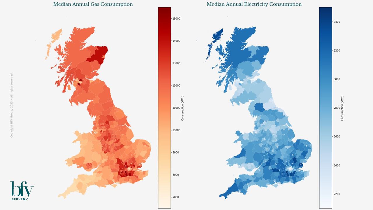
National and Local Consumption – They’re not the same
As mentioned above, the reported headline energy bill (or the Price Cap) is usually treated as a single, nationwide figure (which is currently £1,834). This is based on the actual costs of providing gas and electricity to all regions, and typical domestic consumption values (TDCVs) – defined as the median levels of gas and electricity consumed across the whole UK.
When we compare this with local geographic data, the over generalised nature of the Price Cap starts to become apparent. DESNZ publishes localised consumption values for each local authority, with the most recent data from 2021 revealing a significant variation between areas.
20% variance within 20 miles
As shown in the maps below, average consumption is generally lower in urban areas, presumably due to there being more smaller accommodation types. For example, when comparing the the city of Manchester with its rural neighbour the High Peak region, average gas consumption is 10,669 kWh vs 12,532 kWh – both quite different to the gas TDCV used in the Price Cap (11,500 kWh).
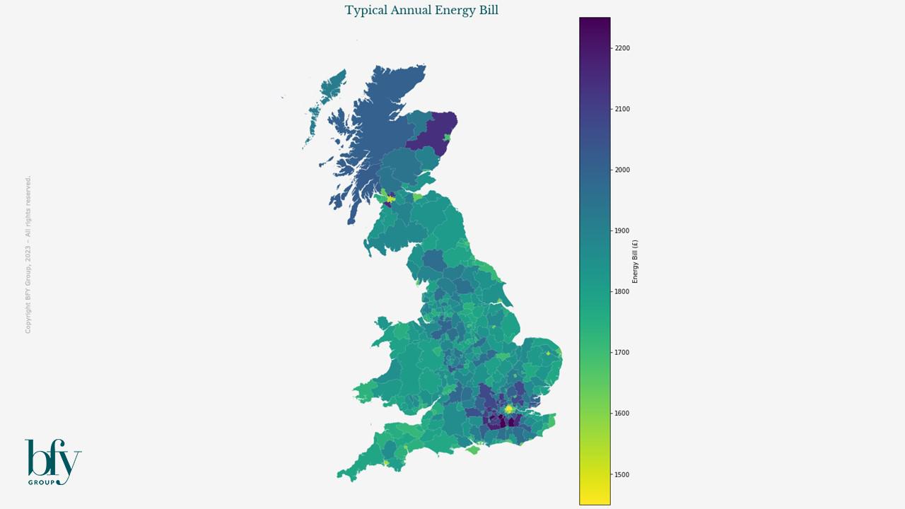
The Price Cap doesn’t reflect local energy bills
Using the same measure of typical consumption (the median annual consumption) for local areas, we’re able to use ‘local TDVCs’ to estimate the typical energy bills for each region. Interestingly, this reveals a range of approximately £900 between the smallest and largest bills across the nation.
The local authorities with the lowest energy bills are predominantly London boroughs, followed by other (but not all) urban areas such as Glasgow (around £1,400). Those with the largest bills are in the outskirts of London, Glasgow, and in Aberdeenshire (around £2,300).
From this information alone, we can argue that the reality of the Price Cap energy bill may be meaningless to consumers with limited knowledge of how the figure is calculated, with very few customers being able to recognise the publicised average of £1,834 in their household expenses.
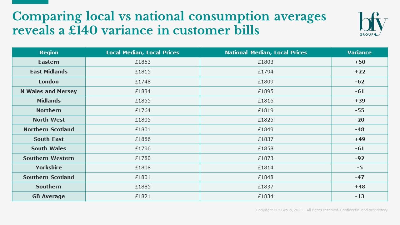
Stepping back to larger regions also shows a disparity between the national Price Cap and regional typical energy bills.
Split by distribution region, the table below shows the difference between bills based on the national median of consumption (used in the Price Cap), and bills based on the local median.
It reveals a swing of £140 depending on geography, which could impact the legacy customer bases driven by historic local monopolies. Given that the costs of energy are dictated by distribution region, this again questions the usefulness of a national value of consumption.
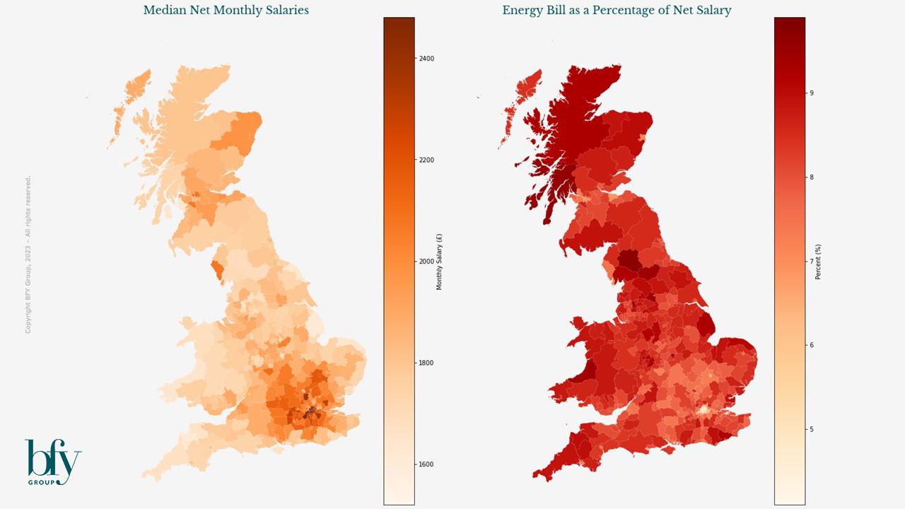
Understanding the relative financial impact of bills
Our final analysis show a direct correspondence between energy bills and median salary. Using the latest available earnings data (2023) published by the ONS, we can see that the areas with the largest energy bills are those with typically the highest net salaries.
Normalising local typical energy bills by the local average salary removes these ‘hot spots’, and shows how higher salaries are associated with increased energy consumption, which is to be expected.
Interestingly, when considering local energy bills as a percentage of salary, we see that in rural and coastal areas, as well as some regional cities, consumers are likely to spend a bigger proportion of their salary on energy.
Therefore, this suggests that on the west coasts of Scotland and Wales, as well as in parts of Cumbria, Yorkshire and the West Midlands, consumers are spending the greatest relative amount of earnings on energy.
These areas typically all have intermediate levels of energy consumption, but salaries lower than the national average. This may be most acute in the more densely-populated areas, for example in the West Midlands, where housing costs would be higher than in the more rural areas.
For these customers with lower usage, standing charges also represent a larger proportion of their bill (up to 23% of the total), as reported in our recent blog.
Overall, it’s clear to see how using a nationalised headline Price Cap figure could be confusing for customers, depending on their own energy consumption.
Consumption levels, and subsequently the amount spent on energy, varies significantly across the country, with the largest gap from actual bills to the Price Cap being ~£500 (in the outskirts of London, Glasgow and Aberdeenshire).
It’s also evident that in some areas of the country, the proportion of earnings spent on energy is significantly larger than others, which poses an interesting question for suppliers. Could this information be better reflected in models for vulnerability and debt management? And if there’s a desire to recognise this information, how much influence should it have on the options available to customers?
To explore our interactive heatmap of local bills, consumption, and income, click here.
If you’d like to receive analysis like this directly to your inbox, subscribe to our Market Insights mailing list here.
For more information on the Energy Price Cap, contact John de Bono or Matt Turner.
John de Bono
Consultant
John performs various analyses to provide BFY and their clients with unique insights, which help to inform decision making and inspire exceptional performance.
View Profile